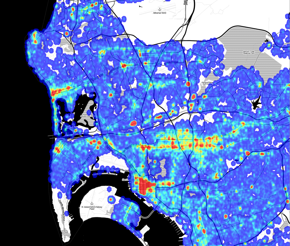
As part of our upcoming Crime Mapping project, we’ve started producing maps of San Diego area cime incidents, and have made a few interesting discoveries that we’d like to share. While these aren’t ground-breaking insights, the results do confirm intuition and offer some small surprises.
A few months ago we received and processed the SpotCrime.com free database, a database of crime incidents from across the country for the years 2007 to 2011. This data was scraped from many different police department websites, although the San Diego data was all scraped from ARJIS ( part of SanDAG ) before SANDAG changed the map software, eliminating the possibility of free acess. This database is a wonderful resource, and even though the data does not have an official pedigree, there are enough datapoints to do some useful work. SpotCrime is providing an incredible benefit by offering this data. Thanks!
Our first stage of analysis involves creating heatmaps from the incidents. To create these maps, we quantized the incidents into bins 1/5000 of a degree square, about 19m. Since the records are typically reported with a “hundred block address” — “1300 Wilbur Ave” instead of “1324 Wilbur Ave” — we added a bit of randomness to the points. While this isn’t exactly correct, as it randomly moves the incident by up to 100m, it does space the points out in a more natural way. Then, for each incident, we spread out the crime point ( with a 2-D Gaussian, fwhm = 57m) to smooth out the image. The spreading also simulates both the extended “influence” of a crime, and the fact that a crime at one point means it is more probable that a crime will occur at nearby points.
Violent crimes are separated from from the property crimes with a separate map for each. Here is the violent crime map: ( Click to Enlarge)

The red spots are the areas of the highest number of crimes, and almost all of them are entertainment districts. Violent crime tends to occur at night, where there are a lot of people, and where people are drinking, and an entertainment district has all three conditions.
Here is the map of the property crime incidents. This has more complete coverage because there are a lot more property crime incidents than violent crime incidents.

There are a lot of similarities in where the crimes occur, but the property crimes are more diffuse, and there are many small-scale differences. To find the differences between the two, we can subtract the two maps. In this image, blue indicates areas where property crimes dominate, green is neutral, and red is an area where violent crimes dominate:

Note that in this map, green does not mean “good,” it means that the difference in the density of violent crime and property crime is nearly equal. The green areas can have very high violent crime rates; being green just means they also have high property crime rates.
This map gets really interesting when you zoom in to look at specific spots. Closer examination doesn’t reveal a lot of new discoveries, but it does confirm intuition about where we should find property and violent crimes.
(There is an interesting error in the difference map. The values for each map are scaled so that the range of ±4σ in the original output maps to (0,1] in the final output, so high outliers all have the value of exactly 1. This means that for an area with both high property and violent crime, the difference is exactly 0, which is the no data value. This is why Garnet street in Pacific Beach and the Gaslamp district have areas of no data in the difference map. )
A map like this has a lot of interesting stories to tell, even though the analysis is not very rigorous. We started with data that we can’t vouch for, added randomness, created a map with a lot of arbitrary choices, and ended up with useful insights. The entire process emphasizes that even when data and analysis are not of sufficient quality to make statistical inferences, we can still extract useful knowledge.


