We are probably on the down-slope. It looks like San Diego has hit its peak in new coronavirus cases. This plot shows the daily increase or decrease in the number of confirmed coronavirus cases for San Diego County. In the ideal case, the full plot would look a lot like a Normal distribution ( aka bell curve ) so you can see that we’d just hit the peak a few days ago. From here out, we should see, each day, a smaller number of new cases than the day before.
This is a plot of the new confirmed coronavirus cases per day. The points are the raw data, and the line is the the smoothed data. The last four days have been below the apparent peak, so we ought to see fewer and fewer new cases each day.

Deaths, however, have not hit the peak, because deaths lag cases by about 10 days. Deaths will keep increasing, at least for another few days.
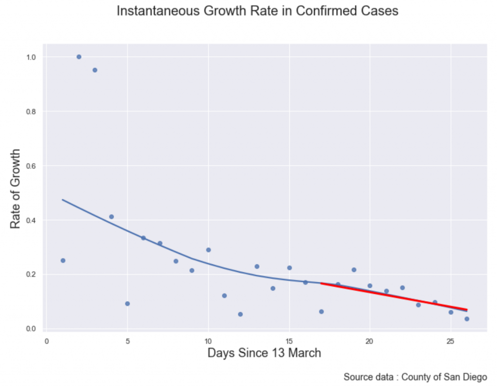
Another view of the growth rate is in percentage per day, this is similar to the previous plot, but each difference value is divided by the number of cases from the day before. The result is the daily growth rate; a value of .33 means that today has 33% more cases than yesterday. A growth rate of 33% per day was the typical rate at the start of the pandemic in most countries, but it has been slowing down everywhere.
In this plot, the blue points are the raw data, the blue line is the smoothed regression line ( loess ) and the red line is the linear regression of the last 10 days. This line will intersect zero at day 32, April 14. That would be the first day that San Diego County has zero new cases, but it is a much earlier prediction that other curve fits, which place the first date of no new cases at day 45 or 50.

Infection modeling is very hard and riven with uncertainty; even the best models from the best modelers require frequent large revisions, so these projections should be considered interesting evidence, rather than solid predictions.
