
We’re about a month in to a crash course on data visualization; nearly every day you are seeing graphs of COVID-19 cases, hospitalizations and deaths, and there has never been a time when so many people know what a logarithmic axis is, or wish they did. Yet, there are some interesting features of the most common graphs that you may not be familiar with
This post will describe the shape of the most common curves, and explain how they are related and what they mean. Note that all of the plots in this post are based on data published by the County of San Diego, which the San Diego Regional Data Library has collected and packaged.
The most basic plot of the coronavirus crisis is the cumulative number of cases, hospitalizations and deaths. Here are these curves for San Diego county:

The “S” shape of this curve is very common. It is frequently called a Logistic curve, but there are many curves with different mathematical bases that have roughly the same shape. The two common are common are the Gaussian Cumulative Distribution Function (CDF) and the Logistic Function. Here is what these two curves look like when fitted to the cumulative number of confirmed coronavirus cases in San Diego County, using the automatic curve fitter built into most statistical software.

Different modellers choose different curves for their models, even when modelling the same disease in the same circumstances. The IHME projections are based on the Gaussian CDF ( more specifically, the Gaussian error function), while other modellers will use the Logistic function. Which one is better for describing coronavirus infections?1
We can assess how well the two curves ( solid lines) fit the black historic points with the Coefficient of Determination, commonly expressed as $R^2$. The $R^2$ value is a lot like a coefficient of correlation; it is 1 when the points exactly lie on the curve, and 0 if there is no relationship at all. ( In fact, for linear regression $R^2$ is the square of the Pearson correlation, under specific conditions. )
In this example, $R^2 = 0.803$ for both the Logistic and the Gaussian curve, so $R^2$ isn’t a deciding factor in choosing one over the other. Statisticians and epidemiologists don’t seem to have a clear consensus on which is preferable. The answer should be rooted in which of the functions has a mathematical basis that is most like the math for the spread of disease, but that method has some problems too. The Logistic function is a natural result of the differential equations that describe a simple model of how people become infected, but Gaussian distributions are an expected result of processes that have a large number of independent, random events. Real data has enough variation in it to overwhelm the differences due to the choice of one curve over the other, but it does seem that the logistic function is the more common choice for epidemiologists.
However, since the differences between the Gaussian and logistics curves are not really important to the present discussion, we’ll refer to them as the S curve and the bell curve.
Regardless of which function you use, there is an interesting property of the curves. If you take an S curve that represents the growing number of cases in a category, such as infected people, and find the difference between successive values — in other words, the new cases per day — you will get something that looks like a bell curve. In the plot below, the blue line is the Gaussian bell curve that you are familiar with. The mathematical function that creates this curve is formally known as a Probability Density Function, or PDF. The orange line is a Cumulative Distribution Function, or CDF.

If you made a table of values for the y values of the CDF ( the S curve) and computed the difference between adjacent rows, you’d get the PDF ( the bell curve). And, if you took all of the PDF values, and made a cumulative sum, a dataset where each value in the PDF is replaced with the sum of all the values before it, you’d get the CDF.
So, if you have an S shape curve — which we have for the running total of COVID-19 cases in San Diego, shown in the first plot of this post — and you calculated the difference between successive values, you’d get the new cases per day, which, if we are lucky, will look like a bell curve when plotted. Are we lucky?
Here are the daily confirmed COVID-19 cases in San Diego versus days from March 13 ( blue dots, ) a local regression (green line) to smooth out the points, and two curve fits to the points. It looks pretty good, although the Gaussian actually has a poor fit to the points ( $R^2=.15$ ), and the logistic fit is better, but not actually good ( $R^2=.34$ ) but at least the shapes are similar.

If we can fit a bell curve to the daily change in cases, we should be able to fit the associated S curve to the cumulative cases. In fact, we can, and the curve fit to the S curve works a lot better that the fit to the bell curve. The curve fits to the S curve is the first plot of this post. Let’s look at that first plot again.
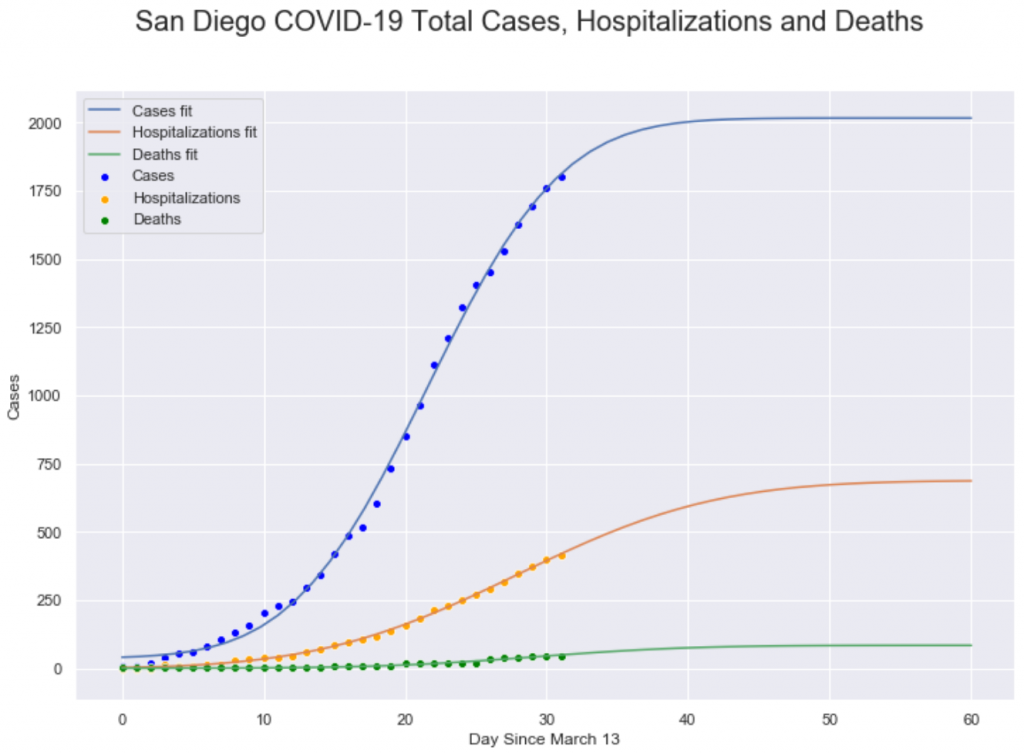
This plot shows the cumulative number of cases, hospitalizations and deaths in San Diego county ( points) along with Gaussian CDF curve fits. These curves have a moderately good fit to the points ( for the Cases line, $R^2=.80$ ). The reason that the S curve fits better than the bell curve is because the variance in changes from day to day are relatively much larger compared to the S curve, because the S curve is the sum of all of the changes. When the errors ( variances ) in the daily changes are summed together, the positive errors cancel out the negative errors, so the S curve ends up with less absolute error and that makes it easier to fit to a curve than the bell curve.
Whether we are fitting to the S curve or the bell curve, there are two important parameters for the curve: the mean ( center ) and the standard deviation ( spread ). Both parameters are important, but for this data, the mean is the most interesting. The mean for a bell curve is the peak of the mountain, the point we we go from increasing number of cases to a decreasing number of cases. For the S curve, the mean ( which is at the same point as in the bell curve) is the center of the long, straight stretch in the middle of the S shape. It’s much easier to see the peak in the S curve
For infection cases, the mean is the point at which the number of infections or hospitalization or deaths stops growing and starts declining, so it’s really valuable to find the middle point. Fortunately, when you fit the S curve to the points, one of the parameters of the fit is the center; that is, the curve fitting routine automatically gives you back the value for the center of the curve, which for this data will be the day that we hit the peak in the number of new cases. For the fits in the plot above, we get these values:
- Cases: Day 22
- Hospitalizations: Day 28
- Deaths: Day 29
Roughly, these values mean that hospitalizations are delayed from cases by 6 days, and deaths are delayed from cases by 7 days and from hospitalizations by 1 day. I’m not entirely sure how San Diego County’s notion of cases relates to the COVID-19 scientific literature, which refers to the onset of symptoms. Fudging a bit, the values do seem to line up in some ways; research reports that from onset to hospitalization is typically 5 days, but from onset to death is about 17 days. I suspect part of the discrepancy in the tie from onset to death is that the death curve has very low values, so the fit is very noisy, with a high error rate. When we have more complete death data, and can get a better fit, the delay value may get longer.
Another common plot you’ve seen is the cumulative number of cases with a logarithmic y axis. The logarithmic axis is important because exponential growth is a straight line on a logarithmic plot, and the slope of the line is the rate of change, so lines that are more vertical in a logarithmic plot are growing faster. However, infections don’t grow at an exponential rate; they are mostly exponential at the start but they quickly turn into curves, so the logarithmic plot becomes less useful as the infection proceeds.
However, plots with logarithmic axes have another important feature; they compress large distances between very big numbers and very small numbers. Note in our first plot that the green deaths line is very close to zero relative to the cases line. Using a logarithmic y axis can make everything seem closer together and easier to compare, at the expense of making the plot harder to understand for novices.

As we noted, the curves are somewhat straight at the start, but quickly bend down, after the infection leaves the early exponential growth phase. But, we can also see the structure of the deaths line, which wasn’t apparent in the linear axis plot.
It is important to note that this discussion has been very qualitative, to emphasize that modeling infections is very good at producing curves of particular shapes, but not very good at predicting exact numbers of infections, hospitalizations or deaths. When working with this data or interpreting this data, it is valuable to have a good understanding of the shape of the curves so you can guess where things are headed, but always be skeptical of claims that the future will turn out the same as a prediction.
(1) After more review of the IHME model, it appears that they don’t have any particularly good reason to use the Gaussian error function, other than it fits the data. While having a strong fit is encouraging, it is very suspicious that their model doesn’t have a theoretical connection to the disease infection process.