
The IHME projections for hospital utilization are probably the most popular data of the movement, just as the Financial Time charts were a few weeks ago. You’ve probably seen variations of this plot

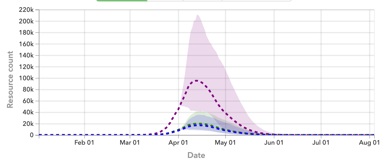
everywhere online, and variations of it from The New York Times and NPR. You’ve also probably seen contrarians criticizing it for being unstable. Those contrarians aren’t entirely wrong; the error margins — the light purple band, for instance — are very large, representing a large uncertainty in the projections. That should not be surprising, since predicting the future is difficult.
Here is another view of the changes in the projections. This plot shows the IHME projections for daily deaths for two versions of the projections, one from about 1 April, and one from about 9 April:

Fortunately, the projections have been revised down, but the large differences in projections, over a week, should convince you to take the published error margins into account when interpreting these data.