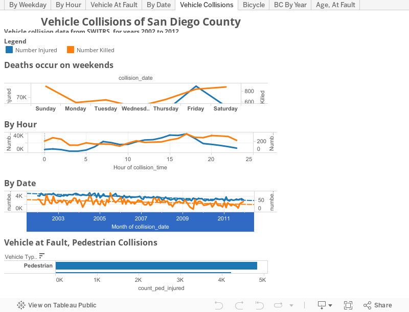
We recently converted the SWITRS database of traffic collisions in California, extracting the records for San Diego County and creating a basic visualization in Tableau Public. Tableau Public is a fantastic data analysis tool, although it takes a bit of training to do complex things.
Below is a simple visualization of the number of people killed and injured in San Diego county traffic collisions by day of week and hour of day, for the years 2002 to 2012, inclusive. The deaths line (orange) shows a familiar “bathtub” shape, with higher values on weekends and at night. The injured line is quite different. There are a lot of possibilities for this, including statistical effects due to the 100x difference in the number of injuries and deaths, or the qualitative differences between pedestrians at night during those of the day. For instance, it may be that injuries during the day are driven by travel patterns and reduced attentiveness in the afternoon, while fatalities are driven by alcohol consumption.
Fortunately, there is enough information in the SWITRS dataset to test some of these hypothesis, but that will be the subject of another post.